Session details
Objectives
- To learn how to create common research plots with ggplot2.
- To become aware of the other powerful features of ggplot2.
- To learn about some of the fundamentals of easily creating amazing graphics.
- To know what resources to use for help and for continued learning.
At the end of this session you will be able:
- Create commonly used graphs such as:
- Bar plots (when to use and when not to use)
- Boxplots
- Line and other time graphs
- Dot/jitter plots by one or more groups
- Plotting by a group (e.g. male vs female)
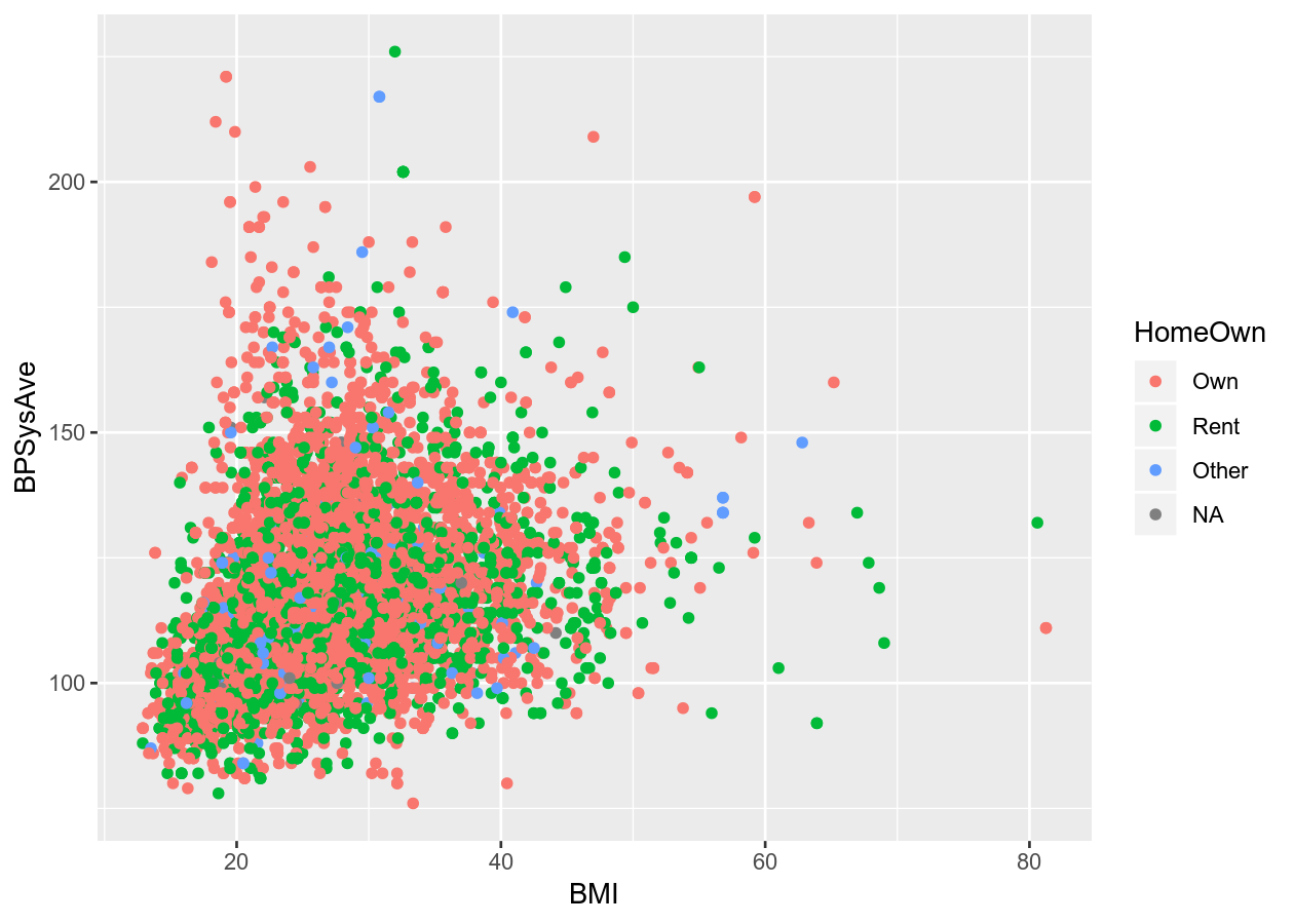
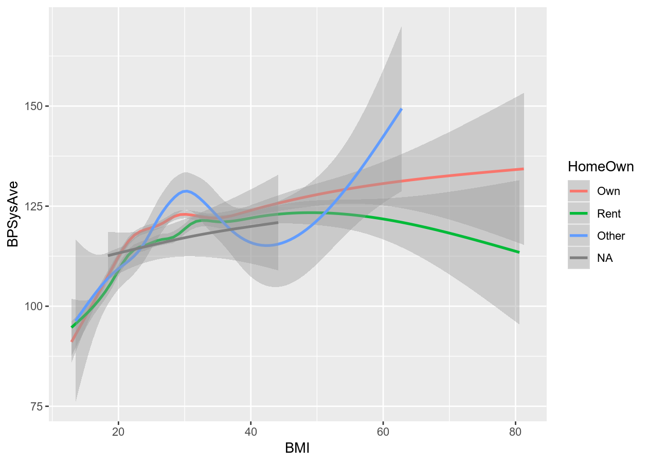
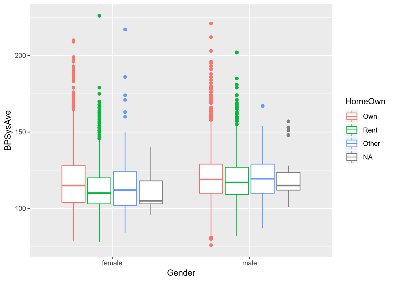
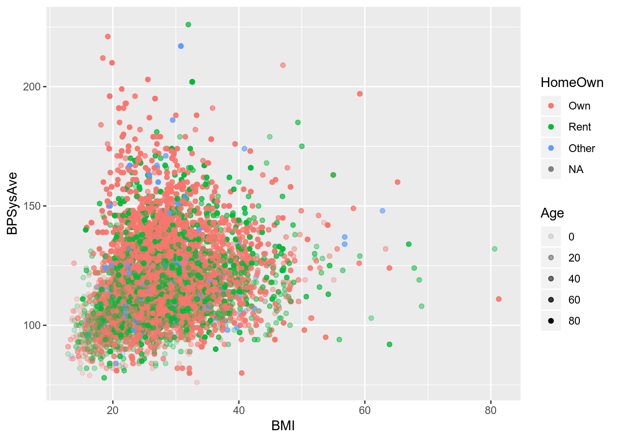
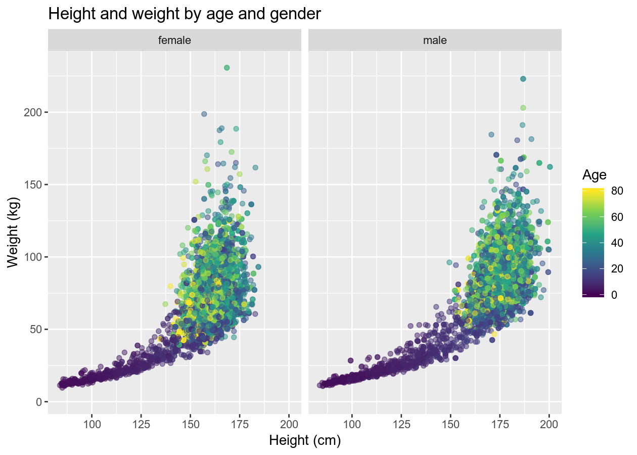
Expected learning
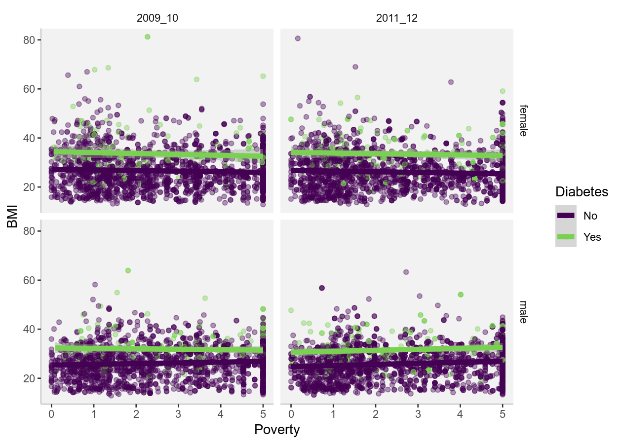
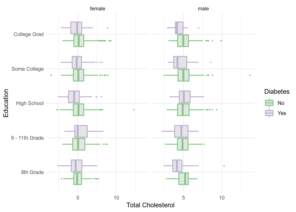
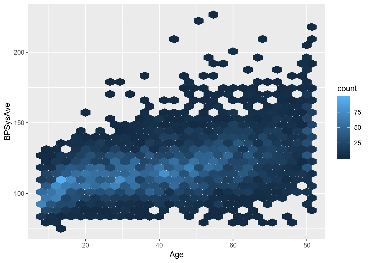
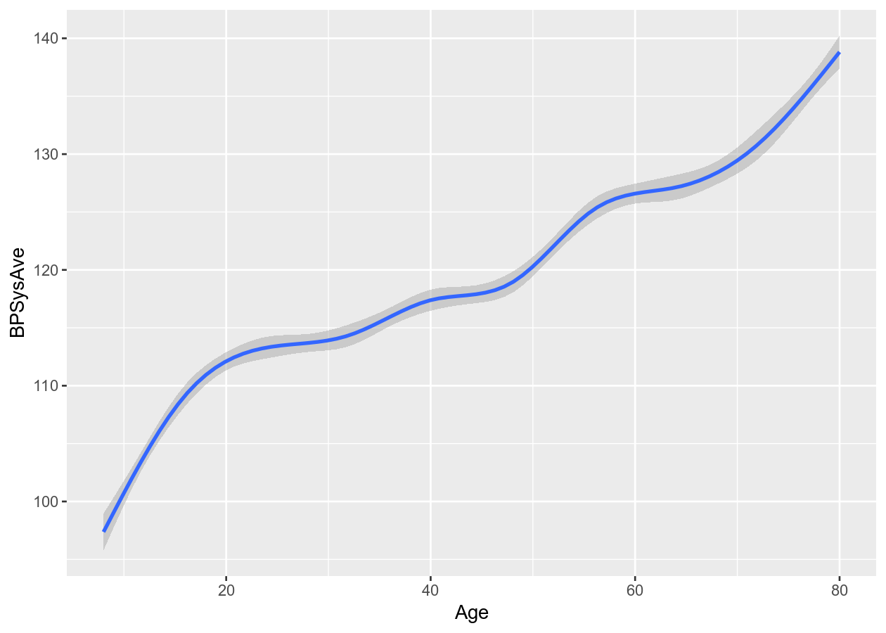
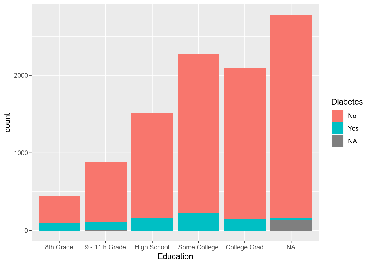
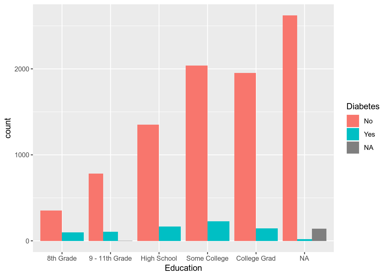
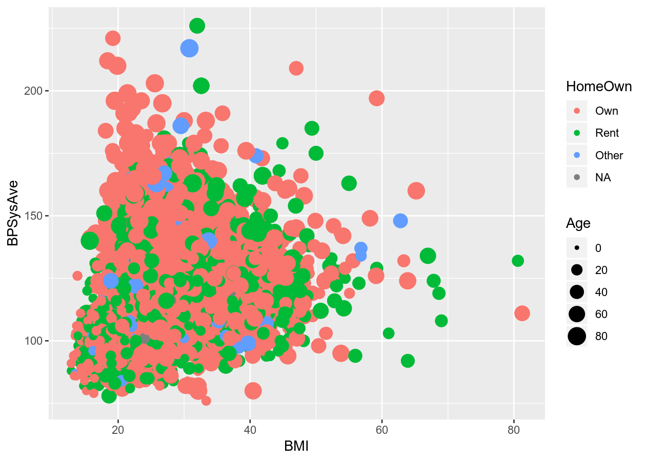
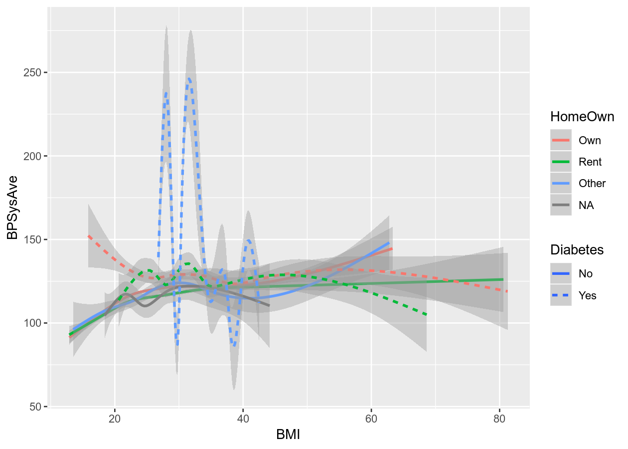
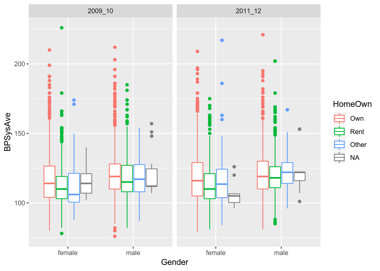
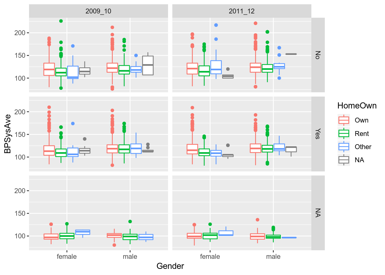
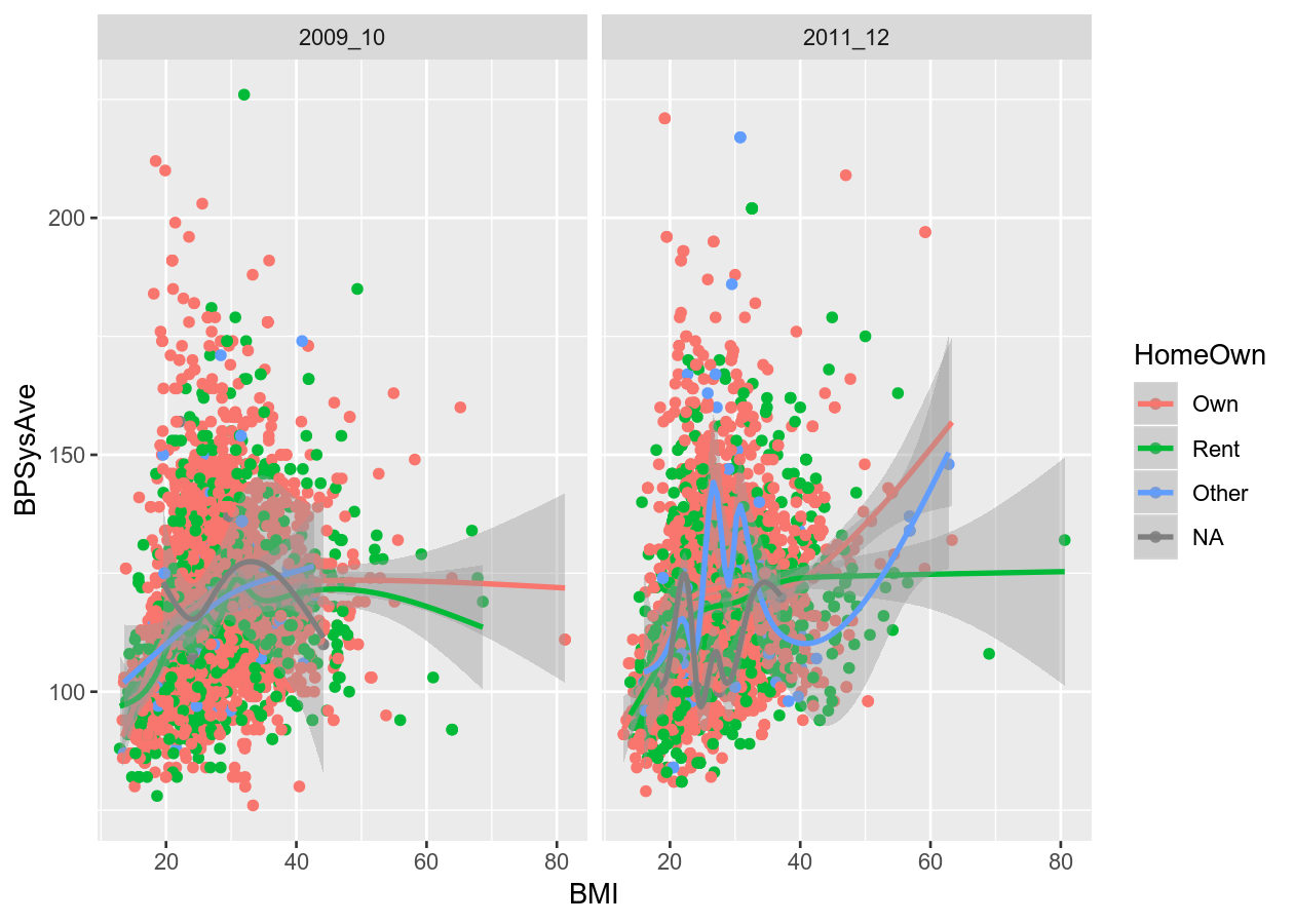
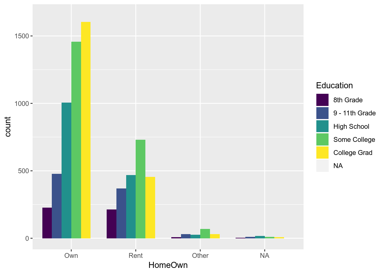
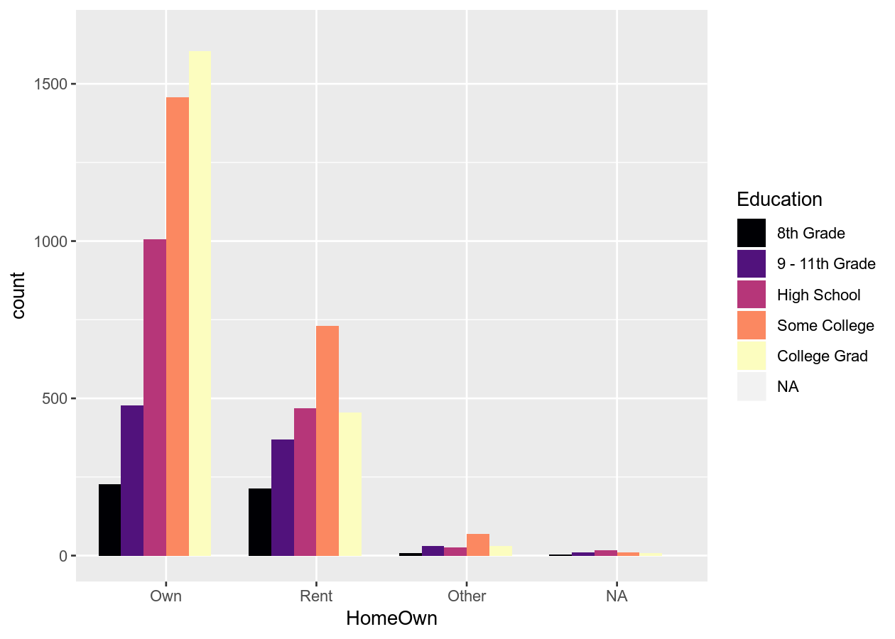
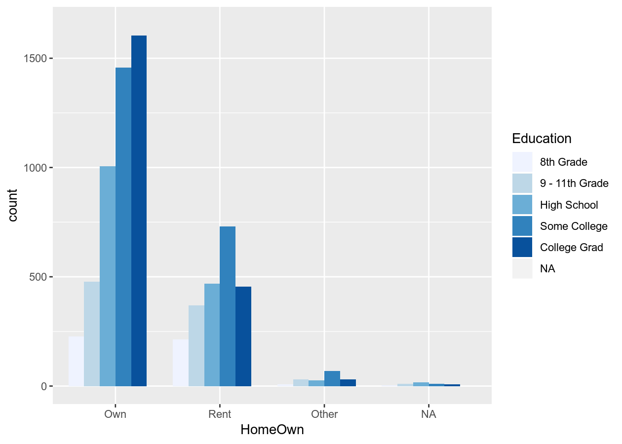
By the end of this you will try to get the data from NHANES to look like the
below figures. We don’t expect you to get it exactly, but try to get close to
them. By (getting relatively close to) replicating these figures, you will have
achieved our learning expectations.
Best practices for creating graphs
Making graphs in R is fairly easy with very little code… so easy in fact that you can quickly do things that don’t make sense or that might detract from what you are trying to communicate. So here are some tips to think about when making a graph (make sure to check the resources at the end of the page for more detail on these tips):
- If you can, show the raw data values rather than summaries
- Though commonly used, avoid barplots with error bars
- Reduce non-data ink or “chartjunk” (e.g. anything on plot that isn’t relevant to the data)
- Enhance the data ink (see here)
- Use colour to highlight and enhance your message, not just for visual beauty
- Use a colour-blind friendly palette (more on this below)
Basic structure of using ggplot2
ggplot2 uses the “Grammar of Graphics” (gg). This is a powerful approach to creating plots because it provides a consistent way of expressing how you actually make the graph. There are at least four aspects to using ggplot2 that relate to “a grammar”:
- Aesthetics,
aes(): How data should be mapped to the plot. For instance, what to put on x axis, on the y axis, whether to have colour based on a (discrete) variable, etc. - Geometries,
geom_functions: The visual representation of the data, as a layer. This tells ggplot2 how to show the aesthetics, for instance as points, lines, boxes, hexes, bins, or bars. - Scales,
scale_functions: Controls the visual properties of the data mapped to the geom layers (e.g. specific colors, point size). - Themes,
theme_functions ortheme(): How the plot overall should look like, such as the text, axis lines, background colours, or inclusion of the legend.
To maximise the power of ggplot2, we recommend to make heavy use of
autocompletion to find all possible options, geoms, etc. You can do this by
typing, for instance, geom_ and then hitting the TAB key to see a list of all
the geoms. Or after typing theme(, hit TAB to see all the options inside
theme.
1-dimensional plots
Plots of 1 dimension are those that are showing only one variable (or column in
a dataset). Generally you create these plots to get a sense of the distribution
of the variable. There are several ways of plotting continuous (e.g. weight,
height) variables in ggplot2. For discrete (e.g. terrain type: mountain, plains,
or sex: woman, man) variables, there is really only one way. You can see all
available “geoms” by starting to type geom_ and then hit the Tab button to list
all possible geoms. Open the previously used R Project, then open the
visualization-session.R script in the R/ folder. This script we will use for
the code-along, but not for the exercises.
# tidyverse contains ggplot2
library(tidyverse)
library(NHANES)
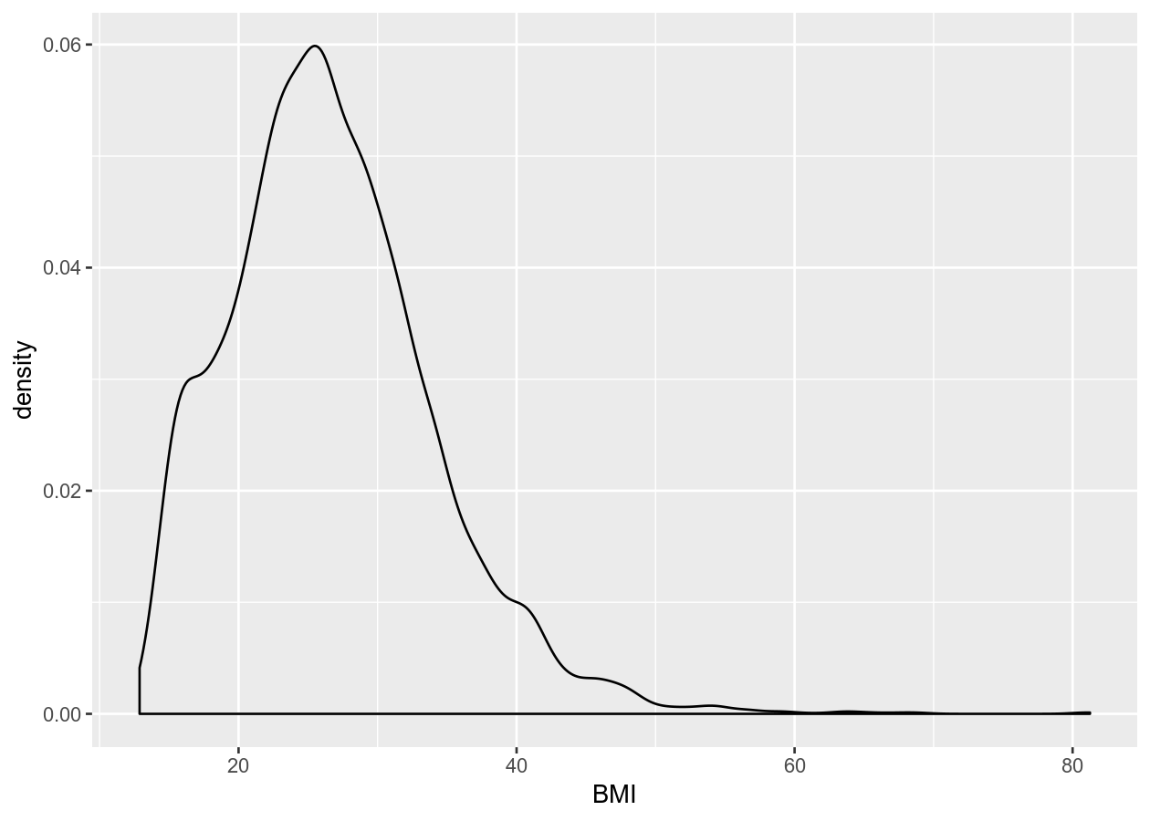
# Continuous
# Good practice to have a new line after the "+"
ggplot(NHANES, aes(x = BMI)) +
geom_density()
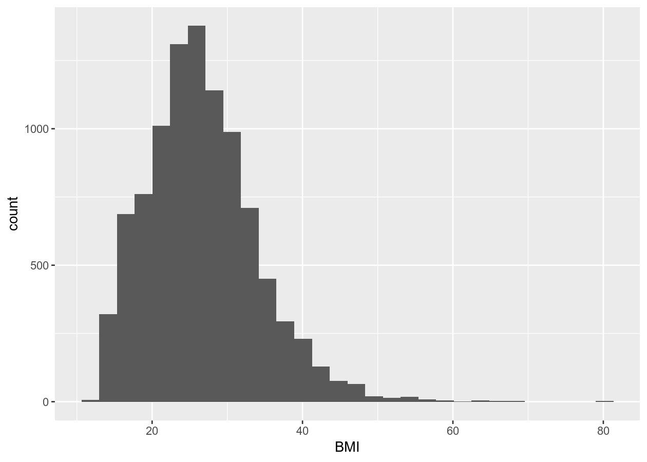
ggplot(NHANES, aes(x = BMI)) +
    geom_histogram()
#> `stat_bin()` using `bins = 30`. Pick better value with `binwidth`.
# Discrete
ggplot(NHANES, aes(x = Education)) +
    geom_bar()
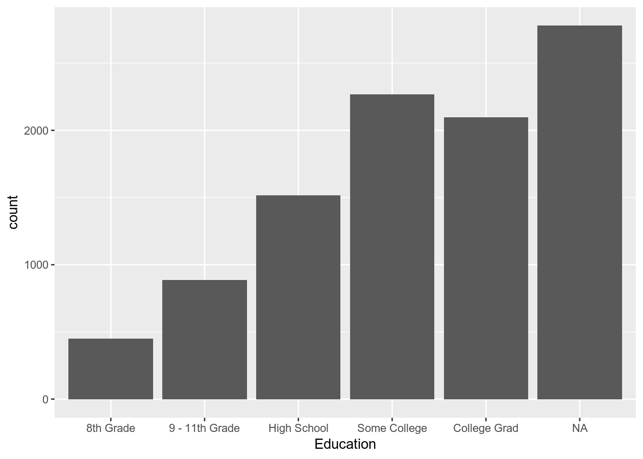
Here we created a bar plot. The only time you should create a bar plot is when the data is categorical and you want to show counts or proportions. That’s it. A common use in scientific articles is to use bar plots to show the mean and have a error bar. But this type of plot hides the underlying distribution of the data and deceives the reader into what the data is actually saying. For more information, see the article on why to avoid barplots. The image below, taken from that paper, shows why this plot type is not useful. Another thing you’ll find out if you want to create a plot like this in ggplot2 is that it is very difficult to do… and that is by design because it is a bad plot choice.
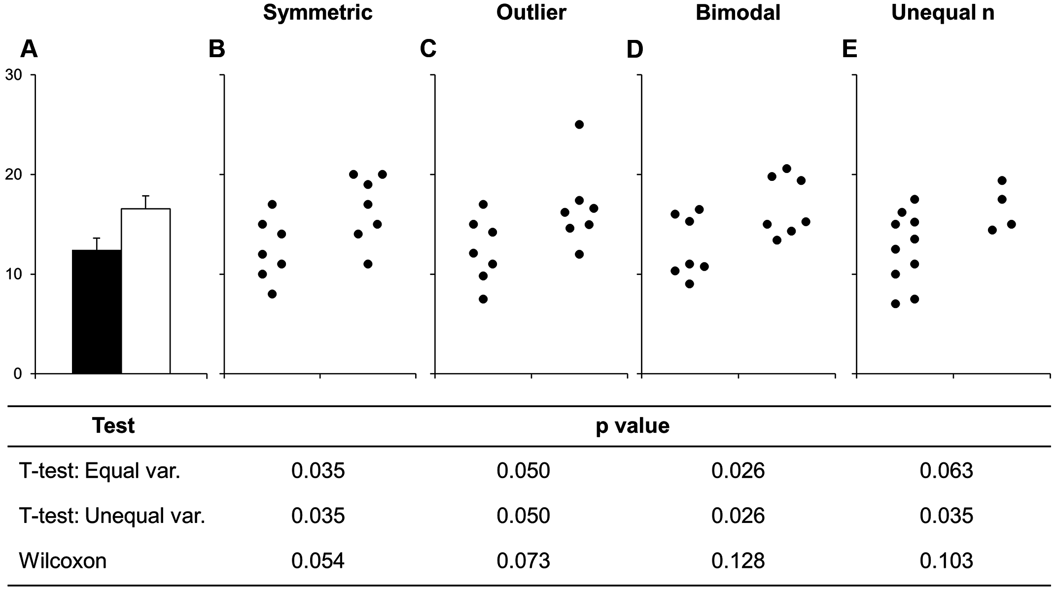
Figure 1 Bars deceive what the data shows. Image source from a PLoS Biology article
2-dimensional plots
You can of course include data on the y axis too! This is usually what you use graphs for! There are many more types of “geoms” to use for having data on both axes, and which one you choose depends on what you are trying to show or to communicate, and what the data is like. Usually you put the variable that you can influence (the independent variable) on the x axis and the variable that responds (the dependent variable) on the y axis.
Two continuous variables
For two continuous variables, there are lots of options available.
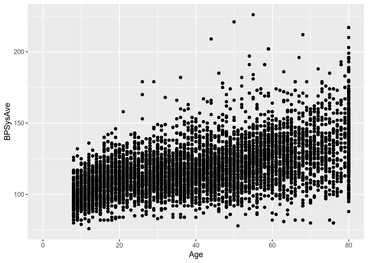
# Using 2 continuous
two_nums <- ggplot(NHANES, aes(x = Age, y = BPSysAve))

# Standard scatter plot
two_nums +
    geom_point()
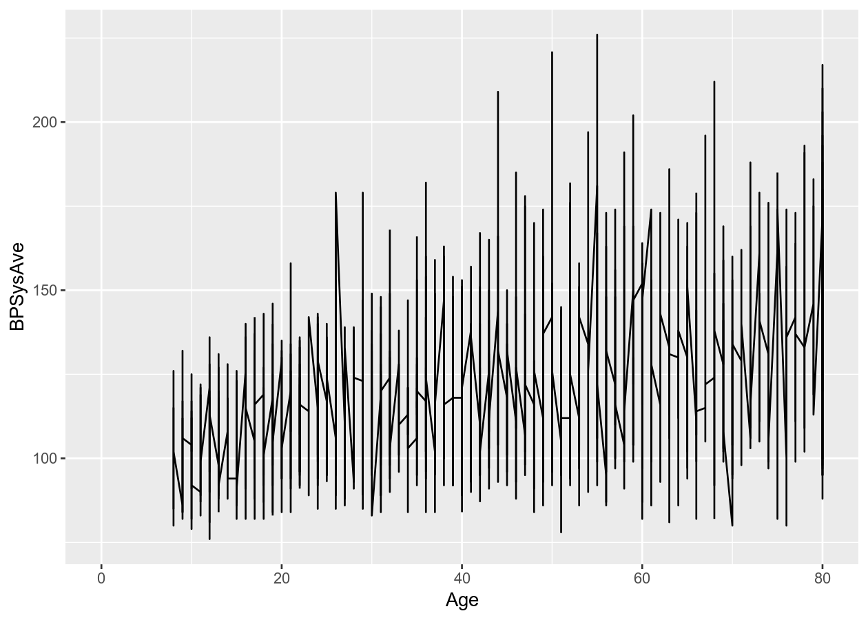
# Connect all the data with a line
two_nums +
    geom_line()
# Put overlapping data into "hexes".. useful for massive datasets
two_nums +
    geom_hex()
# Runs a smoothing line with confidence interval
two_nums +
    geom_smooth()
#> `geom_smooth()` using method = 'gam' and formula 'y ~ s(x, bs = "cs")'
Two discrete variables
For two discrete variables, there isn’t as many options.
# 2 categorical/discrete
two_categ <- ggplot(NHANES, aes(x = Education, fill = Diabetes))

# Stacked
two_categ +
    geom_bar()
# Side-by-side by using position_dodge for groupings (e.g. fill)
two_categ +
    geom_bar(position = position_dodge())
Discrete and continuous variables
As with the two continuous variables, there are many options for plotting mixed data types.
# Using mixed data
two_mixed <- ggplot(NHANES, aes(x = Diabetes, y = TotChol))

# Standard boxplot
two_mixed +
    geom_boxplot()
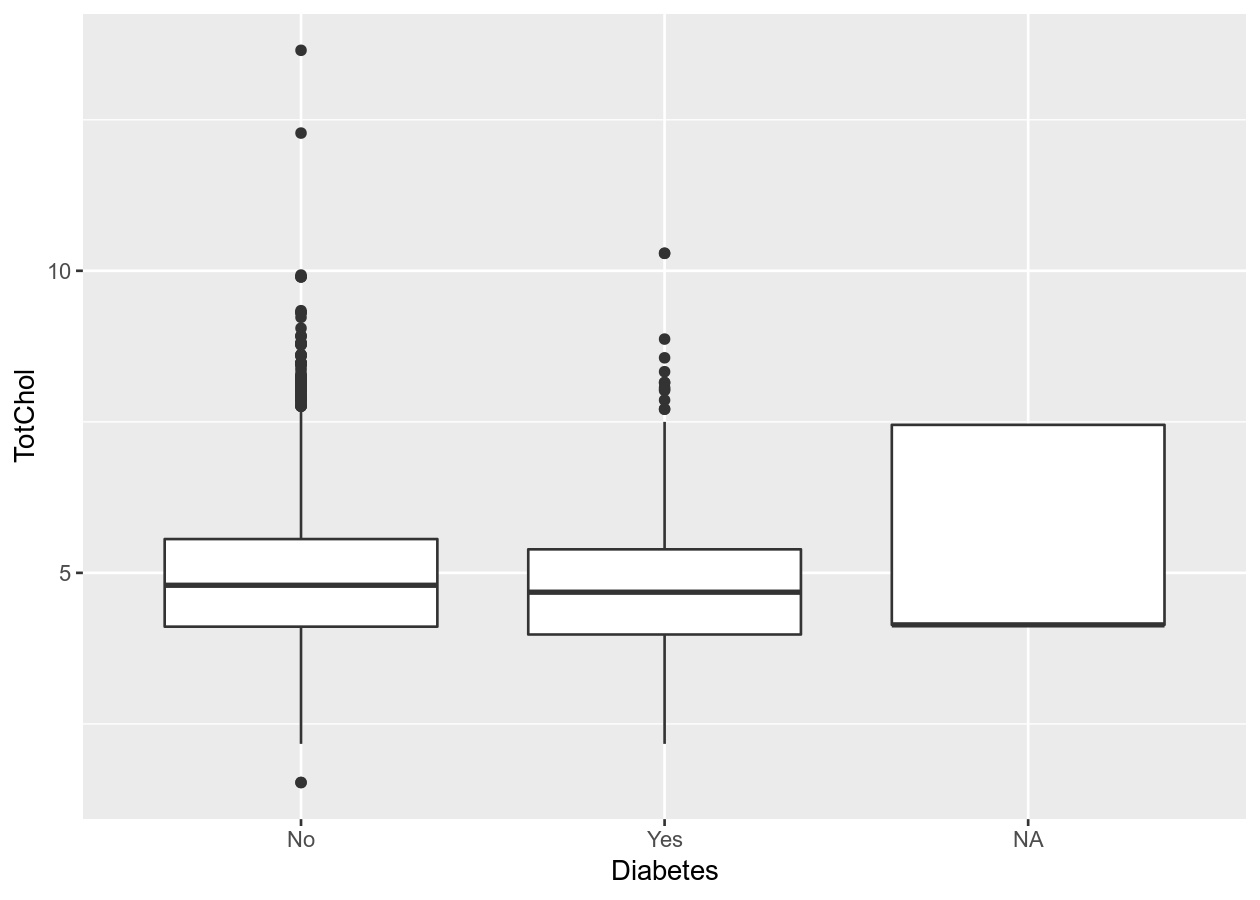
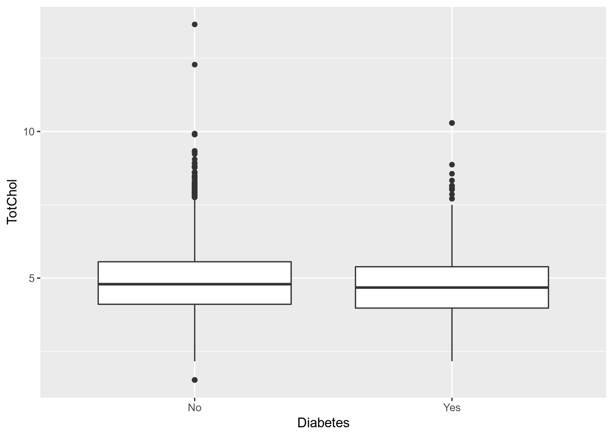
# To remove NA, need to remove from data
# Combine with dplyr:
NHANES %>%
    filter(!is.na(Diabetes)) %>%
    ggplot(aes(x = Diabetes, y = TotChol)) +
    geom_boxplot()
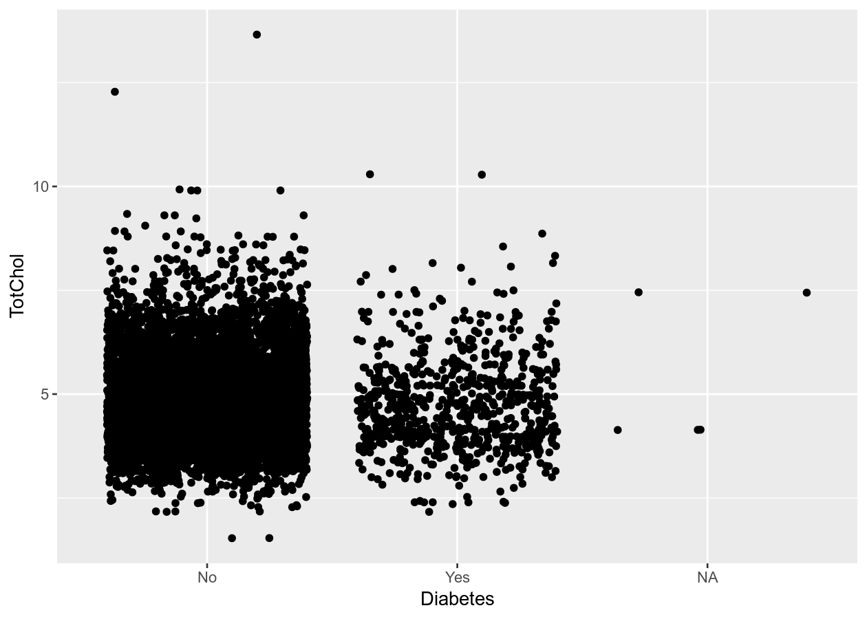
# Better than boxplot, show the actual data!
two_mixed +
    geom_jitter()
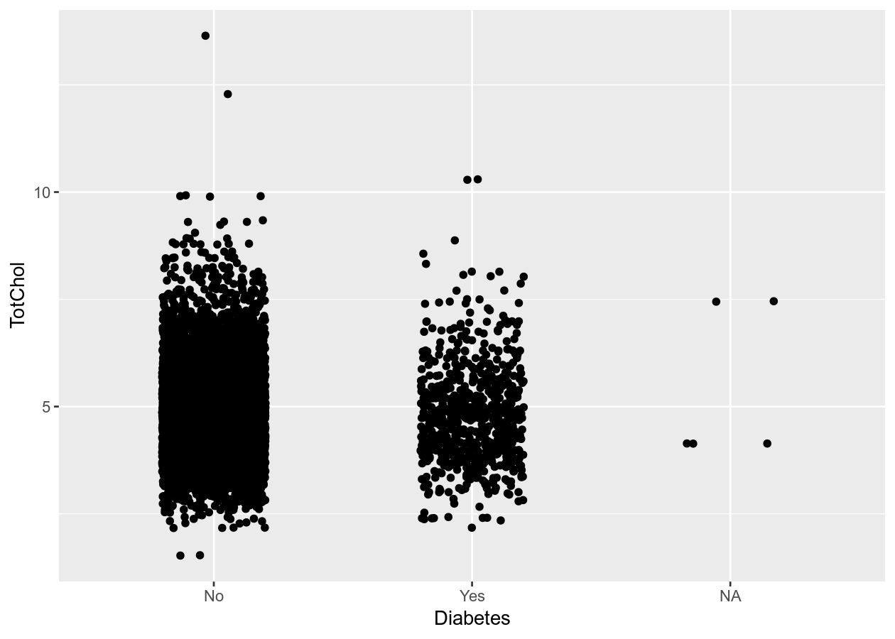
# Give more distance between groups
two_mixed +
    geom_jitter(width = 0.2)
Exercise: Create plots with one or two variables
Time: 10 min
Create an exercise script by typing in the console
usethis::use_r("exercises-visualizing"). Copy the code below into that script.
Fill in and complete the code by using either your own data or using the NHANES
dataset to create a plot with:
- 1 continuous variable.
- 1 discrete variable.
- 2 continuous variables.
- 2 discrete variables.
- 1 continuous and 1 discrete variable.
# See the variables available
names(___)

# 1 continuous
ggplot(___, aes(x = ___)) +
    ___

# 1 discrete
ggplot(___, aes(x = ___)) +
    ___

# 2 continuous
ggplot(___, aes(x = ___, y = ___)) +
    ___

# 2 discrete
ggplot(___, aes(x = ___, fill = ___)) +
    ___

# 1 continous and 1 discrete
ggplot(___, aes(x = ___, y = ___)) +
    ___
Click for a possible solution
# See the variables available
names(NHANES)
# 1 continuous
ggplot(NHANES, aes(x = Testosterone)) +
geom_density()
# 1 discrete
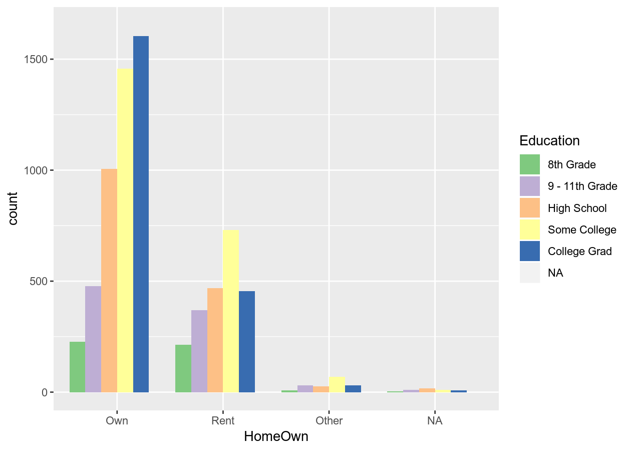
ggplot(NHANES, aes(x = HomeOwn)) +
geom_bar()
# 2 continuous
ggplot(NHANES, aes(x = BMI, y = BPSysAve)) +
geom_point()
# 2 discrete
ggplot(NHANES, aes(x = SmokeNow, fill = Diabetes)) +
geom_bar(position = position_dodge())
# 1 continous and 1 discrete
ggplot(NHANES, aes(x = Gender, y = Pulse)) +
geom_boxplot()
3 or more “dimensions” (variables)
You can also add an additional dimension to the data by using other elements (colours, size, transparency, etc) of the graph to represent another variable. This is NOT the same thing as using 3-dimensional (e.g. with x, y, z axis) plots, which should be avoided unless absolutely necessary! Using colours to represent discrete groups is useful, or for using shading to represent a range in continuous values.
# Continuous and discrete
# Note, we can use the pipe %>% to put the data into ggplot
colour_plot_nums <- NHANES %>%
    ggplot(aes(x = BMI, y = BPSysAve, colour = HomeOwn))

# Scatter plot
colour_plot_nums +
    geom_point()
# Smoothing
colour_plot_nums +
    geom_smooth()
#> `geom_smooth()` using method = 'gam' and formula 'y ~ s(x, bs = "cs")'
# Continuous and discrete
colour_plot_mixed <- NHANES %>%
    ggplot(aes(x = Gender, y = BPSysAve, colour = HomeOwn))
# Boxplot
colour_plot_mixed +
    geom_boxplot()
Or add a fourth variable.
# Scatter plot with alpha (transparency) or size
colour_plot_nums +
    geom_point(aes(alpha = Age))
colour_plot_nums +
    geom_point(aes(size = Age))
# Smoothing plot
colour_plot_nums +
    geom_smooth(aes(linetype = Diabetes))
#> `geom_smooth()` using method = 'gam' and formula 'y ~ s(x, bs = "cs")'
You can also add another variable dimension by “facetting”, which means splitting the data up by the variable and plot by that variable.
colour_plot_mixed +
    geom_boxplot() +
    # Cols means to have them side by side (horizontal)
    # vars() is necessary to access variable from dataset
    facet_grid(cols = vars(SurveyYr))
# Or by another variable
colour_plot_mixed +
    geom_boxplot() +
    # Rows means to have them stacked vertically
    facet_grid(cols = vars(SurveyYr), rows = vars(PhysActive))
And you can add another geom as a layer on top of the previous one by adding
(+) a geom to the next line.
# Three layers
colour_plot_nums +
    geom_point() +
    geom_smooth() +
    facet_grid(cols = vars(SurveyYr))
#> `geom_smooth()` using method = 'gam' and formula 'y ~ s(x, bs = "cs")'
Colours: Make your graph more accessible
Colour blindness is common in the population, and red-green colour blindness in particular affects 8% of men and 0.5% of women. Making your graph more accessible to people affected by colour blindness will also usually improve the interpretability of your graphs for all people. For more detail on how colours look to those with colour-blindness, see this documentation from the viridis package. The viridis colour scheme and R package was specifically designed to represent data well to all colour visions. There is also a really good, informative talk on YouTube on this topic.
When using colours, take time to think about what you are trying to convey in your figure and how your choice of colours will be interpreted. You can use built-in colour schemes, or set your own. Let’s stick to using builtin ones. There are two, the viridis and the ColorBrewer colour schemes. Both are well designed and are colour-blind friendly.
base_boxplot <- NHANES %>%
    ggplot(aes(x = HomeOwn, fill = Education)) +
    geom_bar(position = position_dodge())

# Add the viridis scheme
base_boxplot +
    # _d() is for discrete. _c() is for continuous.
    scale_fill_viridis_d()
# Use another viridis color scheme
# Ranges from A to E
base_boxplot +
    scale_fill_viridis_d(option = "A")
# Or use the brewer scheme
base_boxplot +
    scale_fill_brewer()
base_boxplot +
    scale_fill_brewer(type = "qual")
See all colour palettes for the Brewer palette, use
RColorBrewer::display.brewer.all(). If you use a colour = VariableName in
aes(), you’ll need to use scale_colour_* (either brewer or viridis).
Exercise: Create a three (or more) variable plots
Time: 10 min
In the exercises-visualizing.R script, add a new Section (Ctrl-Shift-R) and
copy the code below into the script. Then, create (with your own data or with
NHANES) several plots with:
- Two continuous (x, y) and one discrete variables (colour), with another discrete variable as the facet. (Optionally include another layer, like smoothing).
- Three continuous variables (x, y, and colour), using the viridis colour palette for continuous data.
- Three discrete variables (x, fill, facet), using the brewer colour palette.
# 1. Two continuous, discrete, and one facet.
ggplot(___, aes(x = ___, y = ___, colour = ___)) +
    ___ +
    facet_
    # Optional: add another layer

# 2. Three continuous, with viridis
ggplot(___, aes(x = ___, y = ___, colour = ___)) +
    ___ +
    scale_

# 3. Three discrete, with brewer
ggplot(___, aes(x = ___, fill = ___)) +
    ___ +
    facet_ +
    scale_
Click for a possible solution
# 1. Two continuous, discrete, and one facet.
ggplot(NHANES, aes(x = Height, y = Weight, colour = Gender)) +
    geom_point() +
    facet_grid(rows = vars(Diabetes))
    # Optional: add another layer

# 2. Three continuous, with viridis
ggplot(NHANES, aes(x = Height, y = Weight, colour = Age)) +
    geom_point() +
    scale_colour_viridis_c()

# 3. Three discrete, with brewer
ggplot(NHANES, aes(x = Gender, fill = Education)) +
    geom_bar(position = position_dodge()) +
    facet_grid(cols = vars(Diabetes)) +
    scale_fill_brewer()
Titles, axis labels, and themes
There are so so so many options to modify the figure, and they are all basically
contained in the theme() function. Search the help documentation using ?theme
or checking out the ggplot2 website. There are way too many customizations
available to show in this session. So we’ll instead cover a few of the options
to give you a sense of how to customize, as well as showing some of the built-in
themes (starting with theme_).
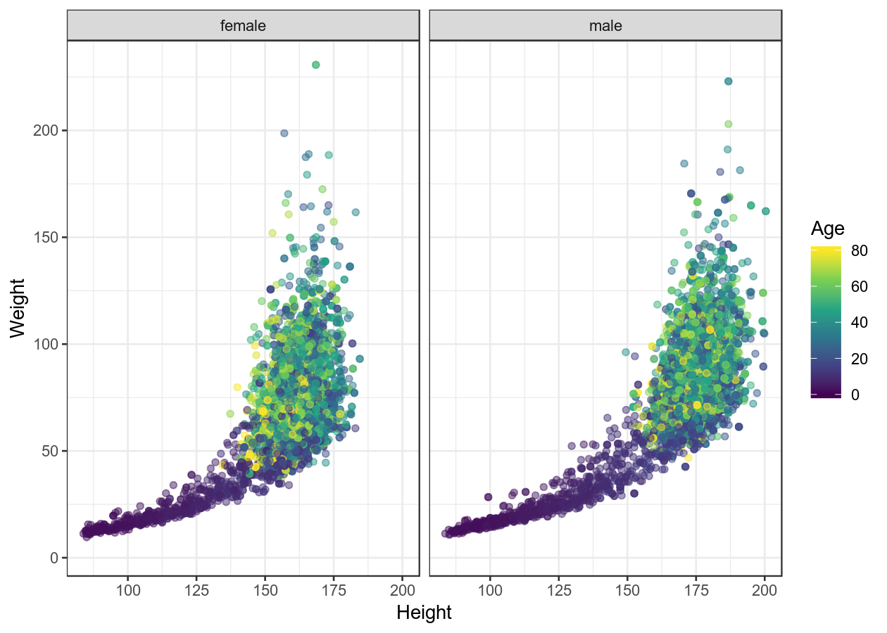
basic_scatterplot <- NHANES %>%
ggplot(aes(x = Height, y = Weight, colour = Age)) +
# use alpha (transparency) since there are so many dots
geom_point(alpha = 0.5) +
facet_grid(cols = vars(Gender)) +
scale_color_viridis_c()
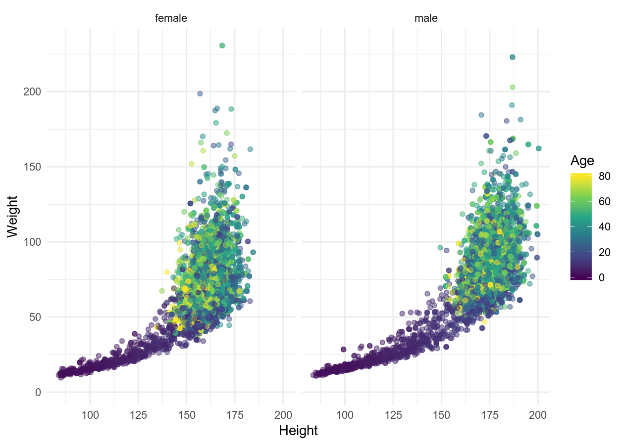
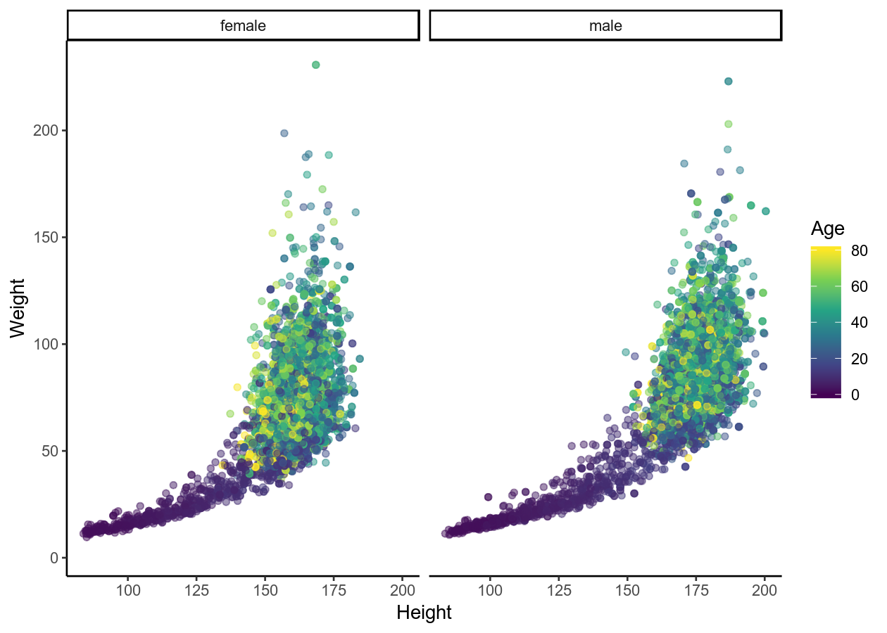
# Some pre-defined themes
basic_scatterplot + theme_bw()
basic_scatterplot + theme_minimal()
basic_scatterplot + theme_classic()
# Adding labels
basic_scatterplot +
    labs(title = "Height and weight by age and gender",
         x = "Height (cm)",
         y = "Weight (kg)")
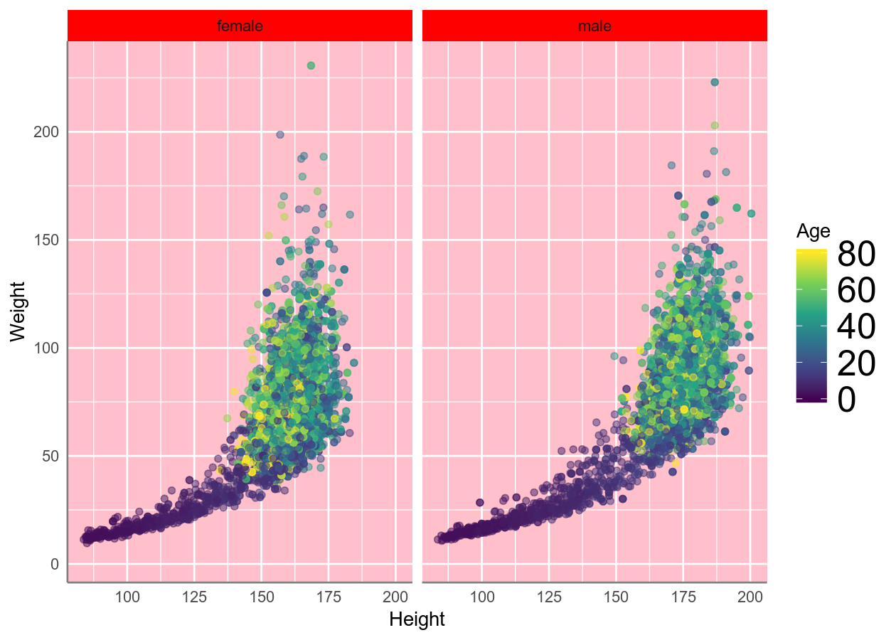
# Edit specific plot items
basic_scatterplot +
    # theme is good at warning you if something isn't right
    # See ?theme for a full list of possible options
    theme(
        # background items must use element_rect
        # panel is the base/bottom layer that all other layers add to
        panel.background = element_rect(fill = "pink"),
        # strip is the section showing the facets
        strip.background = element_rect(fill = "red"),
        # line items must use element_line
        # axis is, well the axis
        axis.line = element_line(colour = "grey50", size = 0.5),
        # text items must use element_text
        # legend is the key when using fill, colour, size, etc
        legend.text = element_text(family = "sans", size = 20),
        # use element_blank to remove
        axis.ticks = element_blank()
    )
Saving the plot
Now, if you want to save the plot, you can do that like this:
plot_to_save <- NHANES %>%
    ggplot(aes(x = Age, y = BMI)) +
    geom_point()
ggsave("plot_to_save.pdf", plot_to_save, width = 7, height = 5)
Final exercise: Putting it all together
Time: Until end of session
In the exercises-visualizing.R script, add a new Section for this exercise.
Then using the NHANES dataset, try to replicate these figures. You very likely
won’t be able to get exactly the same, but try to get close! 😄
Resources for learning and help
For learning:
- R for Data Science
- Data visualisation and Graphics for communication chapters
- Best practices article
- Data Visualization: A practical introduction (a free online book)
- Fundamentals of Data Visualization
- ggplot2 package documentation
- ggplot2 cheatsheet
- DataCamp (paid) online course on data visualistion
- Article to avoid barplots.
For help:
- StackOverflow for ggplot2
- Using within RStudio help using
?(such as?geom_pointor?theme) - ggplot2 package documentation
Acknowledgements
Parts of this lesson were modified from a session taught at the Aarhus University Open Coders, as well as from the ggplot2 sessions of the UofTCoders course. Much inspiration was also taken from the R for Data Science book and the Fundamentals of Data Visualization.